theDataMap
| States | Risks | Buyers |
| Maps | Who? | 1997 |
| Reports | History |
| News | About |
| Contact | Sponsors |
Organizations
| Map.
Legend:  click for details,
 with your name,
 without your name.
|
About Data Maps
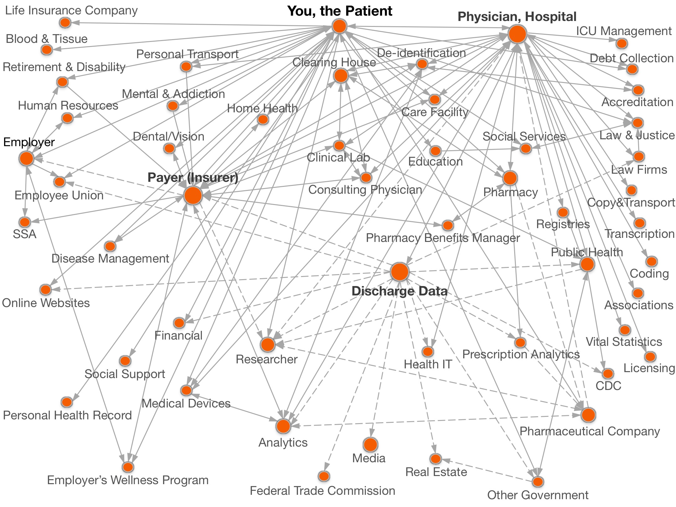
A data map appears as an arrangement of circles connected by and lines. The circles represent a generic category of organizations. A line connects two circles to denote a data sharing arrangement between the two kinds of organizations. Clicking on a circle displays a detailed description, often including a list of example organizations by name that are engaged in the data sharing activity described. For example, in the data map above, Retail Pharmacy and Prescription Analytics are generic nodes and the edge connecting them denotes the sharing of personal prescription information from the retail pharmacy to the analytics company. Clicking on Prescription Analytics describes IMS Health as one such company. |
Beyond Health theDataMap™ project is not limited to health data, but its inspiration comes from data maps used to depict flows of patient data. In 1997, the National Academy Press published a data map showing flows of patient information. In 2001, the California Healthcare Foundation constructed another health data map. Both of these depict routine sharing of patient information prior to the promulgation of the Health Information Portability and Accountability Act Privacy Rule (HIPAA), which protects personal health information in the United States. Recently, in 2010, Dr. Sweeney released a new data map depicting flows of patient information 8 years after the promulgation of HIPAA. The kinds of entities receiving information more than doubled, questioning whether HIPAA offers sufficient privacy safeguards to support the dramatic increase in data sharing. More information about the earlier maps appears at the link below. |